Lecture 8: The machine learning workflow I, time series#
At a glance
Session Lecture 8, Week 4
Arc Machine learning and deep learning
Slides Deck for this session
Practice Practice module for this session
Demo
l08-forecasting.ipynb, forecasting reactor pressure at several horizons and scoring it honestlyTools Polars for the table, scikit-learn for the models and the splits
Assignment A4 is released today and is due Monday 09-28
Why this matters#
Lecture 7 built a feature table and fitted a model to it, and it never asked whether the model was any good. This session asks. The question sounds simple and is not, because a time-series model can report an excellent score and still be useless.
Here is how that happens. Lecture 7 noted that guessing “nothing changes in the next three minutes” on reactor pressure is already close to right. Any model of a fast-sampled channel inherits that closeness for free. Fit a model, predict one step ahead, and you will see predictions that hug the data and an R-squared near 0.99. Most of that score belongs to the guess, and none of it tells you whether the model knows anything the guess did not.
Now make the question useful. An operator does not need to know the pressure three minutes from now. They need to know it thirty or sixty minutes from now, early enough to act. The further ahead you look, the worse the free guess gets, and at some point a different free guess wins: “the pressure will be at its usual value.” A model earns its place only if it beats both guesses, at the horizon somebody needs, on data it has never seen.
None of this is specific to a chemical plant. The same three questions (how far ahead, better than what, scored how) decide whether an electricity load forecast, a demand forecast, a weather model or a trading signal is worth anything. Finance supplies the sharpest version. Stock prices behave so much like a random walk that “tomorrow equals today” is very hard to beat. Eugene Fama found in 1965 that the correlations between successive price changes were “extremely close to zero,” and exchange-rate forecasters learned the same lesson in the 1980s, as a case study below shows. Every number in this session comes from our own plant, and each section points out where the same idea shows up elsewhere.
Learning objectives#
By the end of this session you should be able to:
Frame a time-series forecast as a supervised learning problem, stating the horizon and what is known when the forecast is made.
Compare a forecasting model against persistence and mean baselines across horizons, and say whether the model earned its place.
Choose between direct and recursive multi-step forecasting, and explain why recursive errors grow with the horizon.
Evaluate a forecaster with a time-ordered split whose gap is at least the horizon, and explain why a shuffled split inflates the score.
Use forecast residuals as a simple anomaly detector, setting the threshold on normal data and reporting false alarms and detection delay.
Time series as supervised learning#
Machine learning, for this course, means fitting a function to data instead of deriving it
from physics. You already did this once. In Lecture 7 you built a design matrix \(\Phi\) and a
target vector \(y\), and numpy.linalg.lstsq returned the coefficients \(\theta\) that made
\(\Phi\theta\) as close to \(y\) as possible. Everything in this session is that same step with
better bookkeeping.
Definition: supervised learning
Supervised learning fits a function from a table of features (the columns you know) to a target (the column you want), using rows where both are known. Once fitted, the function predicts the target for new rows where only the features are known.
scikit-learn, the library we use from here on, gives every model the same two methods.
fit(X, y) learns from the training rows. predict(X) returns a prediction for any rows
with the same columns. A linear model, a random forest and a gradient-boosted ensemble all
look the same from the outside, which is why you can swap one for another in a single line.
Parameters and hyperparameters#
Two kinds of number go into a fitted model, and it helps to keep them apart.
Definition: parameter and hyperparameter
A parameter is a number the fitting chooses, such as the coefficients \(a\) and \(b\) of an ARX model. A hyperparameter is a number you choose before fitting, such as how many lags to include or how strongly to penalize large coefficients.
The distinction matters because the fitting procedure can only optimize parameters. If you also pick hyperparameters by looking at how well the model does on some data, that data has been used for fitting too, and it can no longer tell you how the model will do on new data.
The held-out score#
The one genuinely new idea in this section is the held-out score: the error of the model on rows it did not see while fitting. Lecture 7 never computed one. It fitted the model to a run and read the coefficients back, and on that run the model was bound to look good, because the fit was chosen to make it look good on exactly those rows. In other areas of ML this may be called test or validation data.
A held-out score is an estimate of how the model will do in use on data the model has not seen before. It is only an honest estimate if the held-out rows resemble the rows the model will meet in use. For a time series that requirement is harder to meet than it sounds, and the section on evaluating on time is about exactly that.
The forecast horizon#
Lecture 7 predicted the next sample, y[t+1]. A forecast can reach further.
Definition: forecast horizon
The forecast horizon \(h\) is how many samples ahead the model predicts. A model with
horizon \(h\) uses what is known at time \(t\) to predict y[t+h]. On our plant, one sample is
three minutes, so \(h = 10\) is a thirty-minute forecast.
Changing the horizon changes one line of the table. The features stay at time \(t\) and the target moves \(h\) rows into the future:
h = 10
table = df.with_columns(
    [pl.col("xmeas_7").shift(k).over(RUN).alias(f"y[t-{k}]") for k in range(10)]
    + [pl.col("xmeas_7").shift(-h).over(RUN).alias("target")]
).drop_nulls()
The .over(RUN) is Lecture 7’s run-boundary rule. Without it the target of the last rows in
one run is read from the start of the next run.
Before building any table, write down what is known at the moment the forecast is made. The channel’s own past is known. The current valve positions are known. The future valve positions are not known, unless they come from a plan, and this is easy to miss. A load forecaster can use tomorrow’s weather only because a weather forecast for tomorrow exists today. A plant forecaster can use a future setpoint only if the setpoint schedule is written down in advance. Anything else in the future is leakage, the same failure Lecture 7 named for a single row, now stretched across \(h\) rows.
What makes a series forecastable#
Some series can be forecast and some cannot, and you can usually tell which before fitting anything. The tool for telling is the autocorrelation function.
Definition: autocorrelation
The autocorrelation at lag \(k\) is the correlation between a series and itself shifted by \(k\) samples. The autocorrelation function (ACF) plots it against \(k\). A value near 1 means rows \(k\) apart are nearly the same; a value near 0 means they are unrelated.
The figure below shows three series side by side, with their ACFs underneath. The first is
reactor pressure xmeas_7 from one fault-free run. The second is the product separator level
xmeas_12 from the same run. The third is a simulated random walk, which is the textbook model
of a stock price.
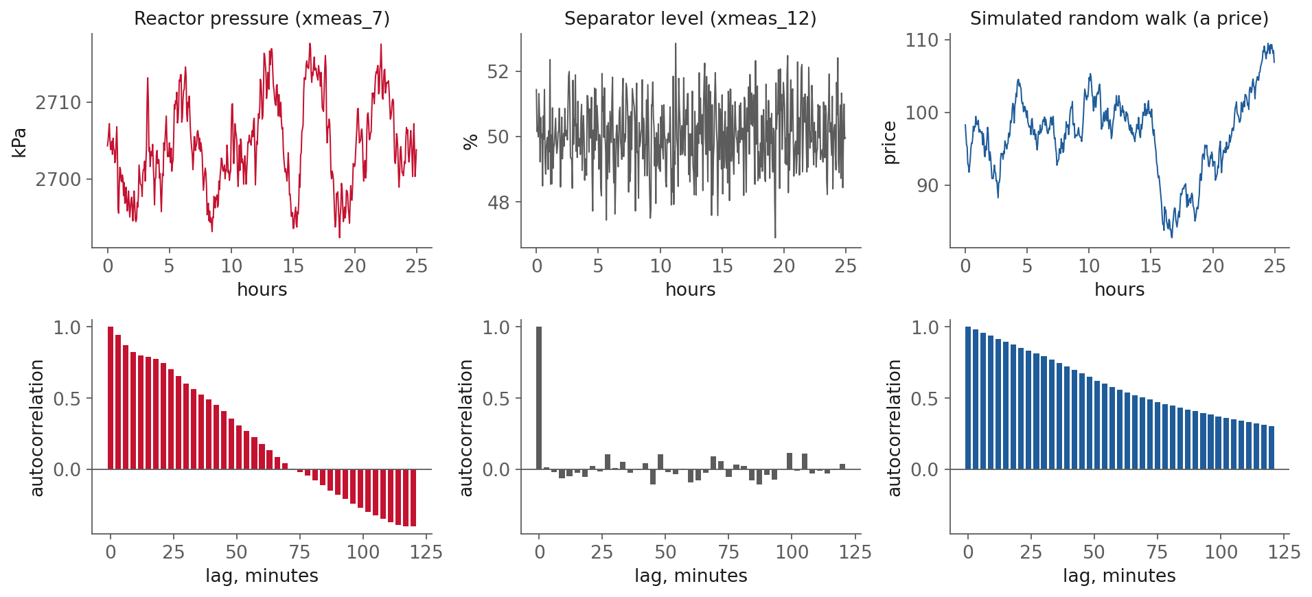
Fig. 19 Three kinds of series. Reactor pressure (lag-1 autocorrelation 0.944) and separator level
(0.015) are from run 1 of the Rieth et al. (2017) fault-free training file. The random walk is
simulated (lag-1 autocorrelation 0.980; its day-to-day changes have lag-1 autocorrelation
-0.012). Generated by figures/make_figures.py.#
Each one calls for a different kind of forecast.
Reactor pressure wanders around a fixed operating level. Its ACF starts near 1 and decays, crossing zero at about 75 minutes and going negative after that, which is the slow oscillation visible in the top trace. Near-term values carry information about the next few samples. Values an hour or more back carry almost none.
Separator level is noise around a setpoint. Its ACF drops to zero immediately. The last
value tells you nothing about the next one beyond the average, because the level controller
removes any deviation before the next sample. Seven of the 22 continuous TEP channels look
like this (xmeas_5, 6, 9, 12, 14, 15, 17). A series with no autocorrelation at any lag is
called white noise.
The random walk has no fixed level at all. Each value is the previous value plus a random step, so the series drifts anywhere. Its ACF stays high for a long time. That looks like good news for forecasting, and it is not: the steps themselves are white noise, so the best forecast of the next value is simply the current one.
Telling the two apart#
Looking at the figure, the obvious difference between pressure and the random walk is that one ACF crosses zero inside two hours and the other does not. That is a property of the window rather than of the process. Carry the same walk’s ACF further out and it crosses too: it reaches -0.26 at 300 minutes and -0.44 at 450. A 500-point series has few independent stretches to average over at those lags, so the long-lag values are mostly sampling noise, and a different random seed draws a different picture.
Three checks do separate them, and all three are worth running on any new channel.
Difference the series and look at the ACF again. This is the decisive one, because it asks the question forecasting actually cares about: is there structure in the changes? Pressure’s changes still carry some, with autocorrelations of +0.146, -0.219 and -0.203 at the first three lags. The walk’s changes carry none, every one of them within 0.06 of zero. A random walk is defined by having unpredictable changes, so this goes straight at the definition.
Ask whether the series returns to a level. Block means over 100 samples at a time run 2701.0, 2703.3, 2706.3, 2704.3 and 2706.8 kPa for pressure, all within about one standard deviation (5.96 kPa) of each other. The walk’s run 96.6, 97.7, 99.8, 89.4 and 100.8, wandering several standard deviations with no level to come back to.
Ask whether the spread grows. A random walk’s variance grows with time, because it is the accumulation of independent steps. On these two series the variance of the last 100 samples is 2.12 times the variance of the first 100 for the walk, against 1.41 for pressure. On 500 points that is suggestive rather than conclusive, which is why the differencing check is the one to reach for first.
The formal versions of this question are the unit root tests, the best known being the
augmented Dickey-Fuller test and the KPSS test. statsmodels has both. They are worth knowing
by name, and on a plant channel they rarely tell you anything the three checks above did not.
One more thing the figure shows and a decaying ACF alone would not. Pressure’s ACF goes negative between about 75 and 150 minutes rather than simply decaying to zero. A first-order process decays exponentially and never crosses, so the crossing says this channel oscillates, with the trough near two hours. That oscillation is structure a model can use, and it is part of why the fitted model still beats persistence at 45 and 60 minutes.
Stationarity#
Definition: stationarity
A series is stationary when its mean, its spread and its autocorrelation do not change over time. A plant held at an operating point is roughly stationary. A random walk is not, because its level can drift arbitrarily far.
Stationarity matters because every model in this session learns from the past and assumes the future looks like it. On a stationary series that assumption is reasonable. On a nonstationary one it can fail badly, since the future level may be somewhere the training data never went.
The standard fix is differencing: model the change y[t] - y[t-1] instead of the level.
A random walk becomes white noise after one difference. In finance this is the move from
prices to returns, and it is why financial models almost always work on returns. The same
idea, applied repeatedly and combined with autoregression, is the “I” (integrated) in ARIMA.
Trend and seasonality#
Two other patterns are common outside a plant. A trend is a slow, sustained change in level, like electricity demand growing year on year. Seasonality is a pattern that repeats on a fixed calendar, like demand peaking every weekday evening. Both make a series nonstationary, and both have standard treatments (differencing at the seasonal lag, or calendar features in the table).
A continuous plant held at an operating point mostly has neither. Where it does have a daily cycle, the cause is usually something measurable, such as the cooling water warming in the afternoon. The better feature is then the measured temperature, not the hour of the day.
What a practitioner should take from this
Plot the ACF before you fit anything. If it drops to zero after lag 0, no model built from the channel’s own past will beat the mean, and the honest report is “this channel is unforecastable from its history.” If the ACF stays near 1 and the series drifts, difference it first.
Baselines and skill#
A baseline is a forecast that needs no fitting. Every model must be compared with one, because an error of 4 kPa means nothing on its own. It means something only next to what you could have had for free.
Definition: persistence forecast
The persistence forecast predicts that the future equals the present: y[t+h] = y[t].
It is also called the naive forecast. Lecture 7 used it without the name when it said
“guess that nothing changes.”
Two baselines cover most of what a plant engineer needs.
Persistence:
y[t+h] = y[t].The mean:
y[t+h]equals the average of the training data.
Other fields add a few more. A seasonal naive forecast copies the value from one season ago (the same hour yesterday, for electricity load). A drift forecast extends the average past change in a straight line. Hyndman and Athanasopoulos cover all four in the chapter linked under Resources.
Which baseline wins depends on the horizon#
For a stationary series the two main baselines can be compared exactly. Call the series’ standard deviation \(\sigma\) and its autocorrelation at lag \(h\) \(\rho_h\). Then the error of the mean forecast is \(\sigma\) at every horizon, and the error of persistence is
Persistence beats the mean exactly when \(\rho_h > 0.5\). Two special cases are worth checking against the figure above. On white noise, \(\rho_h = 0\), so persistence is \(\sqrt{2} \approx 1.41\) times worse than the mean at every horizon. On separator level the measured ratio is 1.415. Where the ACF goes negative, persistence is worse still, because it bets on the wrong side of an oscillation.
On reactor pressure the crossover sits between 30 and 60 minutes. The figure shows the measured errors on 100 held-out runs.
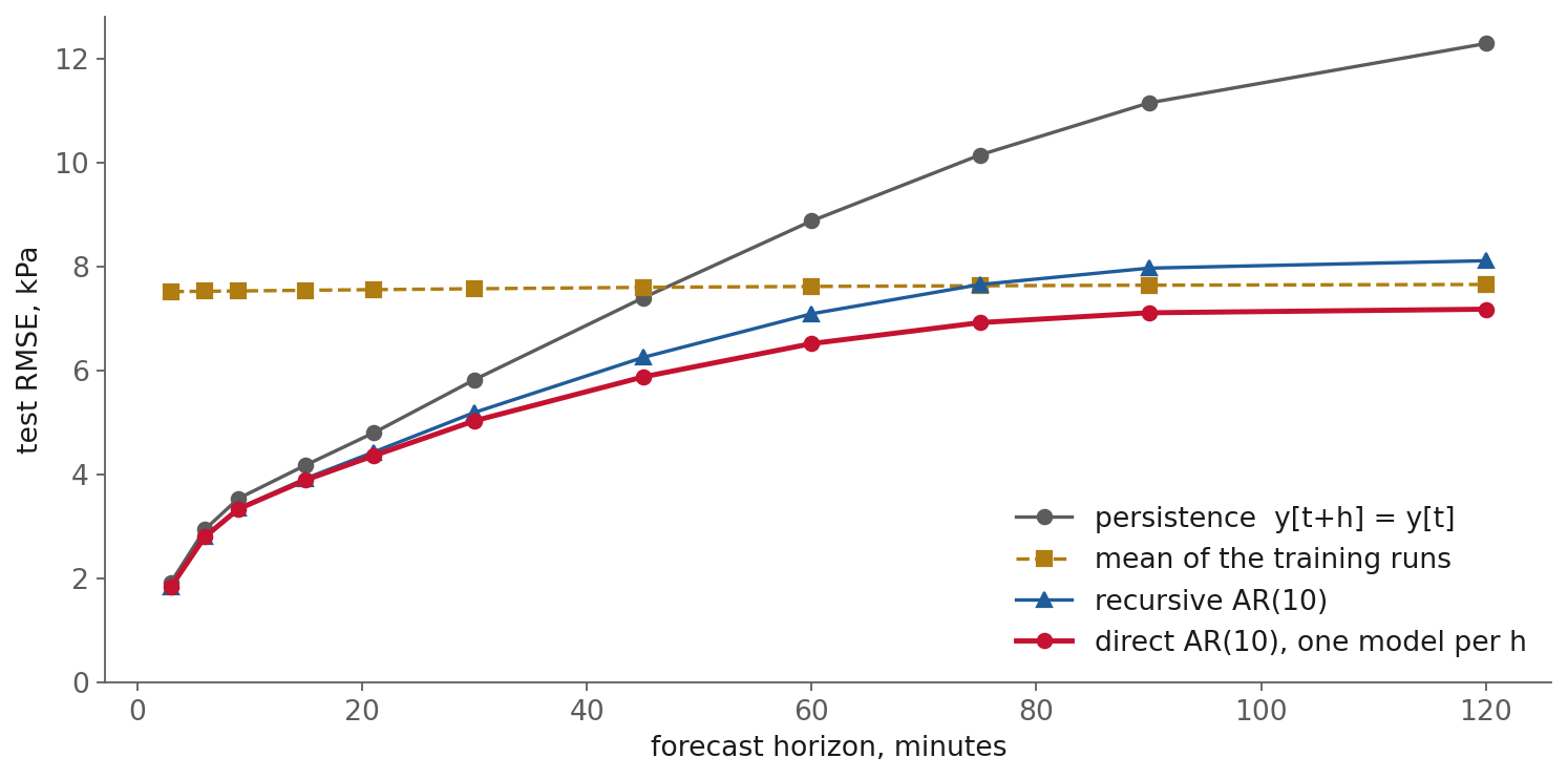
Fig. 20 Test RMSE against horizon for reactor pressure, trained on runs 1 to 300 and tested on runs
401 to 500 of the fault-free file. The standard deviation of pressure on the test runs is
7.51 kPa. Generated by figures/make_figures.py.#
Horizon |
Persistence (kPa) |
Mean (kPa) |
Direct AR(10) (kPa) |
Skill vs. better baseline |
|---|---|---|---|---|
3 min |
1.92 |
7.51 |
1.83 |
5 % |
30 min |
5.82 |
7.57 |
5.02 |
14 % |
45 min |
7.39 |
7.59 |
5.87 |
21 % |
60 min |
8.87 |
7.61 |
6.51 |
15 % |
120 min |
12.29 |
7.65 |
7.17 |
6 % |
Read the table from the top. At three minutes persistence is four times better than the mean and the model adds only 5 %. That small gain is the honest version of the “R-squared of 0.99” from the opening. At two hours the mean is the better baseline and the model again adds little, because pressure two hours out is nearly unrelated to pressure now. The model earns the most in the middle, where neither free guess is good.
Skill scores and MASE#
A percentage improvement over a baseline is called a skill score.
Definition: skill score
A skill score compares a model’s error with a reference forecast’s error on the same data: \(\text{skill} = 1 - \text{RMSE}_{\text{model}} / \text{RMSE}_{\text{reference}}\). Zero means no better than the reference. Negative means worse.
Use the better of the two baselines as the reference at each horizon. Beating the worse one proves nothing.
Hyndman and Koehler (2006) proposed a related scale-free measure, the mean absolute scaled error (MASE). It divides the model’s mean absolute error by the mean absolute error of a one-step naive forecast on the training data. MASE below 1 means the model beats that naive forecast on average. Because it has no units, it can be averaged across series measured in different units, which is what forecasting competitions need.
Report errors in the units of the measurement as well. “5.0 kPa at thirty minutes” is something an operator can judge. A skill score of 0.14 is not.
Case study: the random walk that beat the economists#
Richard Meese and Kenneth Rogoff tested the leading structural models of exchange rates from the 1970s, published in 1983. They forecast the dollar against the pound, the mark and the yen at horizons of one to twelve months, re-estimating each model with rolling regressions so that every forecast used only past data. That is rolling-origin evaluation, a decade before the term was common. The reference was a random walk, which is a persistence forecast.
Their working paper states the result directly: “a random walk model would have outperformed all the other models as a predictor of the logarithm of major-country exchange rates during the 1970’s.” Univariate time-series models and a vector autoregression lost to it too, and so did optimally weighted combinations of the forecasts. The models fitted history well. What they could not do was forecast better than “next month equals this month,” and only the comparison with that baseline showed it.
Case study: simple methods in the M4 competition#
The M competitions, organized by Spyros Makridakis, ask many teams to forecast the same set of real series and score everyone the same way. The fourth, M4, used 100,000 series. Two of its benchmarks were deliberately simple: Naïve2, a persistence forecast with the seasonality removed, and “Comb,” an average of three basic exponential smoothing methods.
The organizers’ summary (Makridakis, Spiliotis and Assimakopoulos, 2018) reports three findings that matter here. Of the 17 most accurate methods, 12 were combinations of mostly statistical approaches. The six pure machine-learning methods “performed poorly, with none of them being more accurate than the combination benchmark and only one being more accurate than Naïve2.” And the biggest surprise was a hybrid of statistical and machine-learning parts, about 10 % more accurate than the combination benchmark. M4 repeats Meese and Rogoff’s result at scale: on real series simple baselines are strong, and a sophisticated model has to show it beats them.
What a practitioner should take from this
Report persistence and the mean next to every forecast, at every horizon you claim. If your model does not beat the better of the two, say so, and ship the baseline. It is cheaper, it cannot overfit, and nobody has to maintain it.
Model families and multi-step strategies#
There are two broad ways to build a forecaster, and they meet in the middle.
The first comes from statistics and control. Autoregressive models predict the next value
as a weighted sum of past values. Lecture 7’s ARX model is one, with an exogenous input added.
ARIMA extends autoregression with differencing (the “I”) and a moving-average term on past
errors (the “MA”). The statsmodels package fits all of these, along with seasonal versions
and state-space forms, and reports standard errors on the coefficients. These models are small,
well understood, and a strong first choice on a single series.
The second comes from machine learning, and it is the one this course uses most. Build the lag
table from the first section, then hand it to any regressor. Ridge regression, a random forest
and gradient boosting all work unchanged, because to them a lag table is just a table. This
move, turning a forecasting problem into an ordinary regression problem, is sometimes called
reduction. It is how scikit-learn’s forecasting examples and the skforecast library work.
The two routes meet at the linear model. A ridge regression on ten lags is an AR(10) model fitted with a small penalty. The difference is what comes next: the regression route lets you swap in a nonlinear model, add window features, or add many exogenous columns without changing any code.
Ridge, and why scaling matters now#
Ridge regression is least squares with a penalty on the size of the coefficients. The penalty helps when the lag columns are nearly copies of each other, which Lecture 7 measured at a correlation of 0.996 on reactor pressure. Without a penalty, nearly identical columns let the coefficients trade off against each other freely.
The penalty has a side effect. It shrinks all coefficients by the same rule, so a column
measured in kPa and a column measured in percent are treated unequally. Plain least squares
gives the same predictions whether or not you rescale; ridge does not. So the columns must be
standardized first, and the scaler must be fitted on the training rows only. scikit-learn’s
Pipeline makes that structural:
from sklearn.pipeline import make_pipeline
from sklearn.preprocessing import StandardScaler
from sklearn.linear_model import Ridge

model = make_pipeline(StandardScaler(), Ridge(alpha=1.0))
model.fit(X_train, y_train)      # the scaler sees training rows only
model.predict(X_test)            # and reuses those means and spreads here
A scaler fitted on all the rows would read the test rows’ mean and spread, which is a small leak, and a pipeline removes the chance to make it.
Direct and recursive forecasting#
To forecast \(h\) steps ahead there are two strategies.
Definition: direct and recursive forecasting
A direct forecaster fits a separate model for each horizon, each trained on the target
y[t+h]. A recursive forecaster fits one model for y[t+1] and applies it \(h\) times,
feeding each prediction back in as if it were a measurement.
The recursive strategy is appealing because it needs only one model, and it produces the whole path to \(h\) in one pass. Its weakness is that each step’s error becomes the next step’s input. Small errors compound, and the model ends up running on its own guesses. This is the “running free” behaviour Lecture 7 mentioned: a model that looks excellent one step ahead can wander off when it has to simulate.
The measurement on reactor pressure shows it. Both strategies use the same ten lags of pressure and the same ridge regression.
Horizon |
Direct (kPa) |
Recursive (kPa) |
Mean (kPa) |
|---|---|---|---|
3 min |
1.83 |
1.83 |
7.51 |
30 min |
5.02 |
5.19 |
7.57 |
60 min |
6.51 |
7.08 |
7.61 |
120 min |
7.17 |
8.11 |
7.65 |
At one step they are identical, as they must be. From there the recursive errors grow faster, and at two hours the recursive forecast is worse than simply predicting the mean. The direct forecaster costs one model per horizon, which for a linear model is nothing.
The recursive strategy has a second problem when the model uses exogenous inputs. To feed
y[t+1] back in, it also needs u[t+1], which is not known at time \(t\). You must either
forecast the inputs too or assume they stay where they are. The direct strategy avoids the
question: it uses only the inputs known at \(t\). Adding the eleven current valve positions to the
direct model lowers its thirty-minute error from 5.02 to 4.71 kPa.
Direct does not always win. Taieb and colleagues (2012) compared recursive, direct and several hybrid strategies on the 111 series of the NN5 forecasting competition, and among the single-model strategies they found the recursive one “has almost always a smaller SMAPE and a better ranking than the DIR strategy.” Their best results came from multi-output strategies that predict the whole horizon at once. Which strategy wins depends on the series and the model, so measure both on your own data, as the table above does.
Window features#
Lecture 7 showed how to compute rolling statistics. The decision it left open is the window length, and a forecasting horizon gives that decision a criterion. A short window follows the latest movement and carries noise. A long window is stable and lags behind a change. Which one helps depends on the horizon: a thirty-minute forecast gains little from a two-minute average of noise, and a three-minute forecast gains little from a two-hour average. Try two or three lengths, and keep the ones that lower the held-out error at the horizon you care about.
Evaluating on time#
A held-out score is honest only if the held-out rows resemble the future the model will face. For a time series that means the held-out rows must come from after the training rows, and must not be near-copies of them.
Why a shuffled split leaks#
The standard recipe for a held-out score is to shuffle the rows and set some aside, or to do that five times over in K-fold cross-validation. On a time series this goes wrong. Lecture 7 named the failure (train-test contamination), and the ACF explains the mechanism. Neighbouring rows are near-copies of each other. When you shuffle, most test rows have their own neighbours in the training set, a few minutes before and a few minutes after. A model that can memorize the training rows can then “predict” a test row by recalling its neighbours, including neighbours from after the test row. The score measures how densely the series was sampled, not how well the model forecasts.
The figure shows the size of the effect on single runs of reactor pressure, thirty minutes ahead, averaged over ten runs.
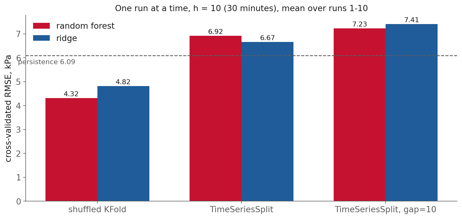
Fig. 21 Cross-validated RMSE at \(h = 10\) (thirty minutes), with ten lags of pressure and the eleven
valve positions as features, one run at a time, averaged over runs 1 to 10. Generated by
figures/make_figures.py.#
Under the shuffled split, the random forest scores 4.32 kPa and ridge 4.82, both well below persistence at about 6.1. Under a time-ordered split, the forest scores 6.92 and ridge 6.67, and both are worse than persistence. The shuffled split reports a model that beats the baseline by 30 %. The honest split reports a model that should not be used.
There is a boundary to this rule, and the data shows it too. When the table pools 200 independent simulation runs, ridge scores 4.74 kPa on a shuffled row split and 4.71 on a split by run. With that much data, one test row’s few neighbours barely move a linear model. Bergmeir, Hyndman and Koo (2018) showed the theoretical version: ordinary K-fold is valid for a purely autoregressive model when its errors are uncorrelated. The rule “never shuffle a time series” is a safe default with known exceptions. The shuffled score is most dangerous when the series is short, the model is flexible, or the errors are autocorrelated, and a single long series has all three.
Rolling origin and TimeSeriesSplit#
The honest alternative is to train on the past and test on what follows, then move forward and repeat.
Definition: rolling origin
Rolling-origin evaluation (also called forward chaining or backtesting) trains on data up to a cutoff, tests on the block after it, then moves the cutoff forward and repeats. Every test block lies after its training block.
scikit-learn implements this as TimeSeriesSplit. Each fold’s training set is everything
before its test block, so the training set grows fold by fold.
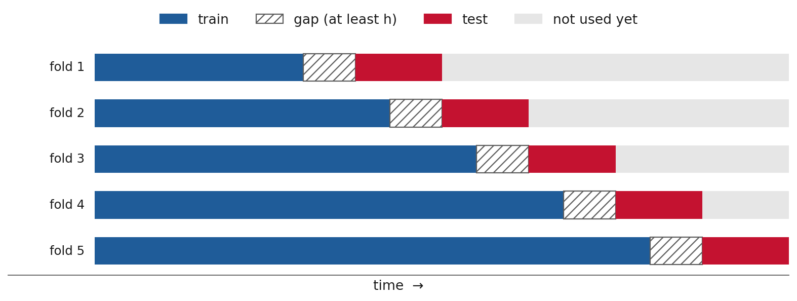
Fig. 22 Rolling-origin evaluation with a gap. Each fold trains on everything before its cutoff, skips a gap of at least \(h\) samples, and tests on the next block.#
The gap must be at least the horizon#
This is the detail most people miss. A row at time \(t\) has target y[t+h]. The last training
row therefore has a target \(h\) samples past the cutoff, which lands inside the test block. The
model was trained on a value it is then tested near. The fix is a gap of at least \(h\) samples
between the last training row and the first test row:
from sklearn.model_selection import TimeSeriesSplit

cv = TimeSeriesSplit(n_splits=5, gap=h)
On the single-run comparison above, adding the gap raised the forest’s error from 6.92 to 7.23 kPa. The difference is small here, and it grows with the horizon, since a larger \(h\) means more training targets land inside the test block.
Many series: split by series#
When the data holds many separate series, such as 500 simulation runs, 300 electricity meters or
the stocks in an index, there is a second way to hold data out: keep whole series out of
training. Our main results train on runs 1 to 300 and test on runs 401 to 500, so no test run
contributed anything to the fit. Within each series, time order still matters for the features,
which is why the table is built with .over(RUN).
Look-ahead and survivorship bias#
Finance has names for two versions of these failures, and they apply everywhere.
Look-ahead bias is using information in a backtest that was not available on the date of the simulated decision. Lecture 7 introduced it for a single column. A shuffled split is the same bias applied to the whole evaluation.
Survivorship bias is testing only on the series that still exist at the end. A backtest on today’s index members ignores the companies that failed and were removed, and it overstates returns. The plant version is a dataset of runs that were kept because nothing went wrong, and the meter version is a dataset of the meters that never broke. A model scored on survivors has not been scored on the cases that matter most.
What a practitioner should take from this
Use TimeSeriesSplit(gap=h) for any single series, and split by series when you have many.
If a shuffled score is much better than a time-ordered one, trust the time-ordered one, and
treat the gap as a warning that the model is recalling neighbours.
Residuals: diagnosis and detection#
A residual is the difference between the measurement and the model’s prediction. Residuals are useful twice: to check the model, and to watch the process.
Checking the model#
If a forecaster has captured everything predictable in a series, what remains should be white noise. Plot the ACF of the one-step residuals. A spike at some lag means there is structure the model missed, and a feature at that lag may help. A slow decay means the model is missing something persistent, often an input that was left out.
Residuals as an anomaly detector#
A model trained on normal operation predicts normal operation. When the process does something the model has never seen, the residual grows. That makes the residual a detector. It will not say what went wrong, but it can say that something did, and it needs no examples of faults to train on.
Definition: anomaly detection
Anomaly detection flags observations that do not fit the pattern of normal data. A residual-based detector raises an alarm when the forecast error leaves the range it occupies during normal operation.
Building one takes three steps.
Fit the forecaster on normal data.
Compute its residuals on other normal data, held out, and choose a threshold from them, for example the 99th percentile of the absolute residual.
Raise an alarm when a new residual exceeds the threshold.
On reactor pressure, a one-step model with the valve positions has a residual standard deviation of 1.70 kPa on the held-out fault-free runs, and its 99th percentile is 4.38 kPa.
False alarms are set by the threshold#
A 99th-percentile threshold is exceeded by 1 % of normal samples, by construction. That sounds small until you count. The plant logs one sample every three minutes, which is 480 a day, so the detector raises about 4.8 false alarms a day. Operators learn to ignore a detector like that within a week.
Definition: false-alarm rate and detection delay
The false-alarm rate is how often the detector fires on normal data. The detection delay is how long after a fault begins the detector first fires. Lowering one raises the other.
A common fix is to require several exceedances in a row. Requiring three consecutive samples above the threshold drops the measured false-alarm rate to 0.01 a day on the held-out runs. The cost is delay, at least six extra minutes for every fault, and more for a fault whose residual flickers across the threshold.
One fault, measured#
The figure shows the detector on fault 1 of the Rieth faulty training file, a step change in the A/C feed ratio introduced one hour into the run.
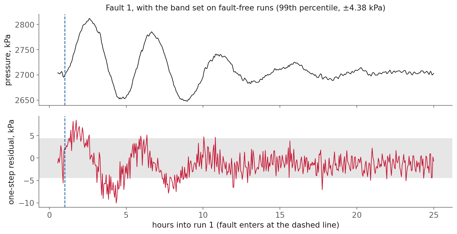
Fig. 23 Reactor pressure and the one-step residual for fault 1, run 1 of the Rieth et al. (2017)
faulty training file. The grey band is the threshold chosen on fault-free runs. Generated by
figures/make_figures.py.#
The three-in-a-row detector fires 45 minutes after the fault begins. Two other things in the figure are worth noticing. First, the pressure swings by 100 kPa, but the residual is only about 5 to 10 kPa, because a one-step model follows a slow swing closely. The residual reacts to what the model did not expect, not to how far the process has moved. Second, the residual returns inside the band as the plant settles into a new steady state, even though the fault is still present. The controller has compensated, and from the pressure channel alone the new state looks normal.
Across all twenty faults on this one channel and run, the detector fires within an hour for faults 1, 7 and 12, fires hours later for several others, and never fires for faults 2, 3, 4, 9, 10, 11, 15 and 16. Many faults do not show up in reactor pressure at all, and a detector watching one channel can only see what that channel sees.
Limitations: when a forecaster fails#
Everything in this session assumes the future resembles the past. Four situations break that assumption, and each one produces a confident number and no error message.
Regime change. A forecaster trained at one operating point, one market regime, or one pre-pandemic demand pattern has no knowledge of any other. When the process moves to a new grade, a new catalyst, or a new normal, the model keeps predicting the old one. The fault 1 figure shows the mild version: the model is out of its depth for several hours after the step. The only defences are to monitor the residuals and to retrain.
Feedback. Lecture 7’s closed-loop case applies here too. Under control, the valve moves because the pressure moved, so the model’s picture of how the inputs drive the output is partly a picture of the controller. Retune the controller and the forecaster’s picture is out of date. Markets have a stronger version: a forecast that many traders act on changes the prices it was forecasting.
Faults that were never in the training data. A residual detector can flag something new, but a forecaster cannot predict through it. After a fault, its forecasts are extrapolations from a regime it never saw.
A horizon ceiling. Beyond some horizon, no model beats the mean, because the series simply does not remember that far back. On reactor pressure, skill falls to 6 % at two hours. More data or a larger model will not move that ceiling much, because the limit is in the process, not in the model. The ACF shows you roughly where it is before you fit anything.
In-class demo#
The notebook is l08-forecasting.ipynb. It downloads the 25 MB
fault-free file from Rieth et al. (2017) on first run and works on reactor pressure throughout.
Build the horizon table. Lecture 7’s
build_arxgains anhargument and a.overon the run key, so the notebook does not depend on having run Lecture 7.Score the baselines. Persistence and the mean at several horizons, on runs held out from training.
Fit direct and recursive models and plot error against horizon, which reproduces the figure in the baselines section. Then look at what those forecasts do rather than what they score: the path ahead from a single origin, a whole test run where every forecast is thirty minutes old, and a parity plot per method.
Shuffle, then don’t. On a single run, compare shuffled
KFoldwithTimeSeriesSplit(gap=h)for a random forest, and watch the shuffled score beat persistence while the honest one does not.
The residual detector stays in these notes, because the faulty file is 500 MB.
Summary#
A forecast is a supervised learning problem with a horizon attached. The features are what is
known at time \(t\), the target is y[t+h], and anything from after \(t\) that is not a plan is
leakage. Whether a series can be forecast at all shows up in its autocorrelation: a channel whose
ACF drops to zero cannot be forecast from its own past, and a random walk is best forecast by its
last value.
A model earns its place only if it beats the better of two free forecasts, persistence and the mean, at the horizon that matters. For a stationary series, persistence wins while the autocorrelation stays above one half. On reactor pressure that is roughly the first 45 minutes, and the fitted model adds most in between the two regimes. Meese and Rogoff’s exchange-rate result and the M4 competition show that the same comparison decides real forecasting problems.
Direct forecasters, one per horizon, held up better than recursive ones on reactor pressure, because recursive errors compound, although published comparisons on other series have found the opposite, so measure the choice on your own data. The score itself has to be earned honestly: train on the past, test on what follows, leave a gap of at least \(h\), and split by series when there are many. A shuffled split on a single run made two models look 30 % better than persistence when both were worse.
Finally, the residuals of a good forecaster are a detector in their own right. Their threshold sets the false-alarm rate, and a threshold that sounds strict can still raise several false alarms a day at a three-minute sampling rate.
Resources#
Hyndman and Athanasopoulos, Forecasting: Principles and Practice, 3rd ed., chapter 5. The simple baselines, forecast accuracy and time-series cross-validation, free online and written for practitioners.
Hyndman and Athanasopoulos, section 9.1, stationarity and differencing. The clearest short treatment of when a series needs differencing.
Hyndman and Koehler (2006), Another look at measures of forecast accuracy. The paper that introduced MASE, and a useful catalogue of what goes wrong with percentage errors (author’s copy).
Hyndman and Athanasopoulos, section 5.2, simple forecasting methods and section 5.10, time series cross-validation. Mean, naive, seasonal naive and drift, then evaluation on a rolling origin.
Meese and Rogoff, Empirical exchange rate models of the seventies: are any fit to survive?. The random-walk result from the first case study. This is the free 1981 Federal Reserve working paper; the 1983 journal version is here and is paywalled.
Makridakis, Spiliotis and Assimakopoulos (2018), The M4 Competition: results, findings, conclusion and way forward. The abstract carries every M4 figure quoted above (index page; the journal version is paywalled). The full results paper, Makridakis et al. (2020), is open access.
Fama (1965), Random walks in stock-market prices. A short, readable account of why price changes are close to unpredictable (Chicago Booth reprint).
Taieb, Bontempi, Atiya and Sorjamaa (2012), A review and comparison of strategies for multi-step ahead time series forecasting. Recursive, direct and the hybrid strategies between them, compared on competition data (arXiv preprint; the journal version is paywalled). Note that its recursive strategy beat its direct one.
Bergmeir, Hyndman and Koo (2018), A note on the validity of cross-validation for evaluating autoregressive time series prediction. The boundary of the “never shuffle” rule (author’s copy).
scikit-learn,
TimeSeriesSplit. The splitter used in this session, including thegapparameter.scikit-learn, Lagged features for time series forecasting. The reduction to regression, built in Polars.
skforecast, recursive multi-step forecasting and direct multi-step forecasting. Both strategies wrapped around any scikit-learn regressor.
statsmodels, time series analysis. AR, ARIMA and state-space models with standard errors, for when a single series deserves a classical model.
Rieth, Amsel, Tran and Cook (2017), Additional Tennessee Eastman process simulation data. The dataset used throughout, CC0.
Assignment#
A4, an h-step forecaster for a plant channel, is released today and is due Monday 09-28.