Plotting two datasets with very different scales

| categories: plotting | tags:

Matlab plot

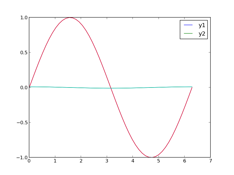
Sometimes you will have two datasets you want to plot together, but the scales will be so different it is hard to seem them both in the same plot. Here we examine a few strategies to plotting this kind of data.

import numpy as np
import matplotlib.pyplot as plt

x = np.linspace(0, 2*np.pi)
y1 = np.sin(x);
y2 = 0.01 * np.cos(x);

plt.plot(x, y1, x, y2)
plt.legend(['y1', 'y2'])
plt.savefig('images/two-scales-1.png')
# in this plot y2 looks almost flat!
>>> >>> >>> >>> >>> >>> [<matplotlib.lines.Line2D object at 0x0000000006089128>, <matplotlib.lines.Line2D object at 0x000000000766B2E8>]
<matplotlib.legend.Legend object at 0x0000000007661668>
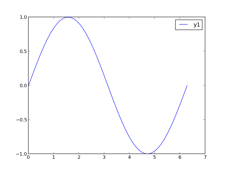
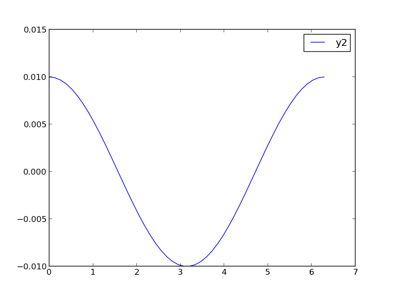
1 Make two plots!

this certainly solves the problem, but you have two full size plots, which can take up a lot of space in a presentation and report. Often your goal in plotting both data sets is to compare them, and it is easiest to compare plots when they are perfectly lined up. Doing that manually can be tedious.

plt.figure()
plt.plot(x,y1)
plt.legend(['y1'])
plt.savefig('images/two-scales-2.png')

plt.figure()
plt.plot(x,y2)
plt.legend(['y2'])
plt.savefig('images/two-scales-3.png')
<matplotlib.figure.Figure object at 0x0000000007D45438>
[<matplotlib.lines.Line2D object at 0x00000000081C61D0>]
<matplotlib.legend.Legend object at 0x0000000007FA1CF8>
>>> >>> <matplotlib.figure.Figure object at 0x00000000081C63C8>
[<matplotlib.lines.Line2D object at 0x00000000081C8F60>]
<matplotlib.legend.Legend object at 0x00000000081D7278>

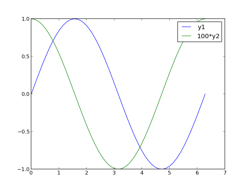
2 Scaling the results

Sometimes you can scale one dataset so it has a similar magnitude as the other data set. Here we could multiply y2 by 100, and then it will be similar in size to y1. Of course, you need to indicate that y2 has been scaled in the graph somehow. Here we use the legend.

plt.figure()
plt.plot(x, y1, x, 100 * y2)
plt.legend(['y1', '100*y2'])
plt.savefig('images/two-scales-4.png')
<matplotlib.figure.Figure object at 0x0000000007FA7908>
[<matplotlib.lines.Line2D object at 0x000000000B0285C0>, <matplotlib.lines.Line2D object at 0x000000000B0287B8>]
<matplotlib.legend.Legend object at 0x000000000B028C88>

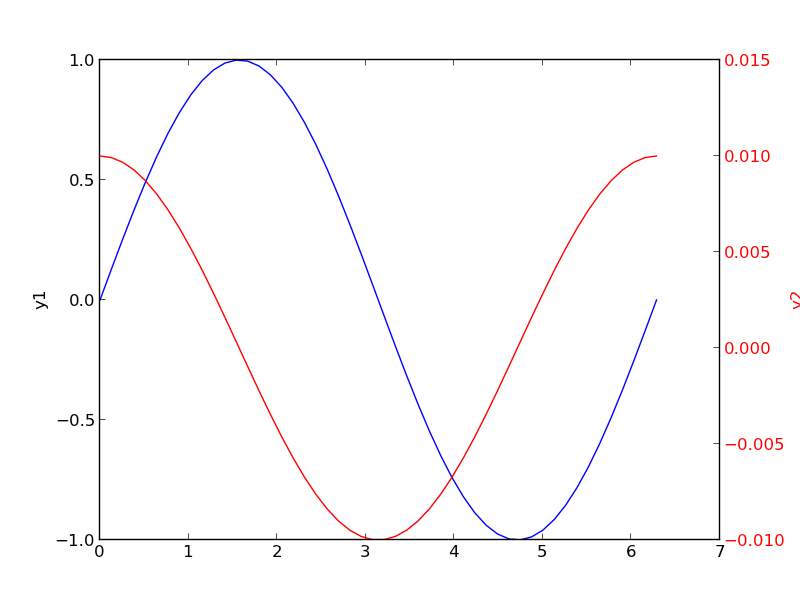
3 Double-y axis plot

Using two separate y-axes can solve your scaling problem. Note that each y-axis is color coded to the data. It can be difficult to read these graphs when printed in black and white

fig = plt.figure()
ax1 = fig.add_subplot(111)
ax1.plot(x, y1)
ax1.set_ylabel('y1')

ax2 = ax1.twinx()
ax2.plot(x, y2, 'r-')
ax2.set_ylabel('y2', color='r')
for tl in ax2.get_yticklabels():
    tl.set_color('r')

plt.savefig('images/two-scales-5.png')
>>> [<matplotlib.lines.Line2D object at 0x000000000BA34208>]
<matplotlib.text.Text object at 0x000000000BA37C50>
>>> >>> [<matplotlib.lines.Line2D object at 0x000000000BA4DEF0>]
<matplotlib.text.Text object at 0x000000000BA594A8>
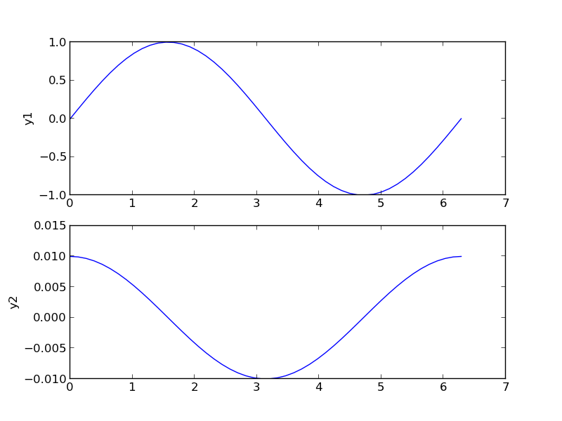
4 Subplots

An alternative approach to double y axes is to use subplots.

plt.figure()
f, axes = plt.subplots(2, 1)
axes[0].plot(x, y1)
axes[0].set_ylabel('y1')

axes[1].plot(x, y2)
axes[1].set_ylabel('y2')
plt.savefig('images/two-scales-6.png')
<matplotlib.figure.Figure object at 0x000000000BDC47B8>
>>> [<matplotlib.lines.Line2D object at 0x000000000BDE2F28>]
<matplotlib.text.Text object at 0x000000000BDD74E0>
>>> [<matplotlib.lines.Line2D object at 0x000000000D05E748>]
<matplotlib.text.Text object at 0x000000000BDEC438>

Copyright (C) 2014 by John Kitchin. See the License for information about copying.

org-mode source

Org-mode version = 8.2.6

Discuss on Twitter

Coupled nonlinear equations

| categories: nonlinear algebra | tags:

Suppose we seek the solution to this set of equations:

\begin{align} y &=& x^2 \\ y &=& 8 - x^2 \end{align}

To solve this we need to setup a function that is equal to zero at the solution. We have two equations, so our function must return two values. There are two variables, so the argument to our function will be an array of values.

from scipy.optimize import fsolve

def objective(X):
    x, y = X            # unpack the array in the argument
    z1 = y - x**2       # first equation
    z2 = y - 8 + x**2   # second equation
    return [z1, z2]     # list of zeros

x0, y0 = 1, 1           # initial guesses
guess = [x0, y0]
sol = fsolve(objective, guess)
print sol

# of course there may be more than one solution
x0, y0 = -1, -1           # initial guesses
guess = [x0, y0]
sol = fsolve(objective, guess)
print sol
[ 2.  4.]
[-2.  4.]

Copyright (C) 2013 by John Kitchin. See the License for information about copying.

org-mode source

Discuss on Twitter
Discuss on Twitter

Visualizing uncertainty in linear regression

| categories: data analysis, uncertainty | tags:

In this example, we show how to visualize uncertainty in a fit. The idea is to fit a model to data, and get the uncertainty in the model parameters. Then we sample the parameters according to the normal distribution, and plot the corresponding distribution of models. We use transparent lines and allow the overlap to indicate the density of the fits.

The data is stored in a text file download PT.txt , with the following structure:

Run          Ambient                            Fitted
 Order  Day  Temperature  Temperature  Pressure    Value    Residual
  1      1      23.820      54.749      225.066   222.920     2.146
...

We need to read the data in, and perform a regression analysis on P vs. T. In python we start counting at 0, so we actually want columns 3 and 4.

import numpy as np
import matplotlib.pyplot as plt
from pycse import regress

data = np.loadtxt('../../pycse/data/PT.txt', skiprows=2)
T = data[:, 3]
P = data[:, 4]

A = np.column_stack([T**0, T])

p, pint, se = regress(A, P, 0.05)

print p, pint, se
plt.plot(T, P, 'k.')
plt.plot(T, np.dot(A, p))

# Now we plot the distribution of possible lines
N = 2000
B = np.random.normal(p[0], se[0], N)
M = np.random.normal(p[1], se[1], N)
x = np.array([min(T), max(T)])

for b,m in zip(B, M):
    plt.plot(x, m*x + b, '-', color='gray', alpha=0.02)
plt.savefig('images/plotting-uncertainty.png')
[ 7.74899739  3.93014044] [[  2.97964903  12.51834576]
 [  3.82740876   4.03287211]] [ 2.35384765  0.05070183]

Here you can see 2000 different lines that have some probability of being correct. The darkest gray is near the fit, as expected; the darker the gray the more probable it is the line. This is a qualitative way of judging the quality of the fit.

Note, this is not the prediction error that we are plotting, that is the uncertainty in where a predicted y-value is.

Copyright (C) 2013 by John Kitchin. See the License for information about copying.

org-mode source

Discuss on Twitter

Uncertainty in the solution of an ODE

| categories: uncertainty, ode | tags:

Our objective in this post is to examine the effects of uncertainty in parameters that define an ODE on the integrated solution of the ODE. My favorite method for numerical uncertainty analysis is Monte Carlo simulation because it is easy to code and usually easy to understand. We take that approach first.

The problem to solve is to estimate the conversion in a constant volume batch reactor with a second order reaction \(A \rightarrow B\), and the rate law: \(-r_A = k C_A^2\), after one hour of reaction. There is 5% uncertainty in the rate constant \(k=0.001\) and in the initial concentration \(C_{A0}=1\).

The relevant differential equation is:

\(\frac{dX}{dt} = -r_A /C_{A0}\).

We have to assume that 5% uncertainty refers to a normal distribution of error that has a standard deviation of 5% of the mean value.

from scipy.integrate import odeint
import numpy as np

N = 1000

K = np.random.normal(0.001, 0.05*0.001, N)
CA0 = np.random.normal(1, 0.05*1, N)

X = [] # to store answer in
for k, Ca0 in zip(K, CA0):
    # define ODE
    def ode(X, t):
        ra = -k * (Ca0 * (1 - X))**2
        return -ra / Ca0
    
    X0 = 0
    tspan = np.linspace(0,3600)

    sol = odeint(ode, X0, tspan)

    X += [sol[-1][0]]

s = 'Final conversion at one hour is {0:1.3f} +- {1:1.3f} (1 sigma)'
print s.format(np.average(X),
               np.std(X))
Final conversion at one hour is 0.782 +- 0.013 (1 sigma)

See, it is not too difficulty to write. It is however, a little on the expensive side to run, since we typically need 1e3-1e6 samples to get the statistics reasonable. Let us try the uncertainties package too. For this we have to wrap a function that takes uncertainties and returns a single float number.

from scipy.integrate import odeint
import numpy as np
import uncertainties as u

k = u.ufloat(0.001, 0.05*0.001)
Ca0 = u.ufloat(1.0, 0.05)

@u.wrap
def func(k, Ca0):
    # define the ODE
    def ode(X, t):
        ra = -k * (Ca0 * (1 - X))**2
        return -ra / Ca0
    
    X0 = 0 # initial condition
    tspan = np.linspace(0, 3600)
    # integrate it
    sol = odeint(ode, X0, tspan)
    return sol[-1][0]

result = func(k, Ca0)
s = 'Final conversion at one hour is {0}(1 sigma)'
print s.format(result)
Final conversion at one hour is 0.783+/-0.012(1 sigma)

This is about the same amount of code as the Monte Carlo approach, but it runs much faster, and gets approximately the same results. You have to remember the wrapping technique, since the uncertainties package does not run natively with the odeint function.

Copyright (C) 2013 by John Kitchin. See the License for information about copying.

org-mode source

Discuss on Twitter
« Previous Page -- Next Page »