Visualizing uncertainty in linear regression
Posted July 18, 2013 at 07:13 PM | categories: data analysis, uncertainty | tags:
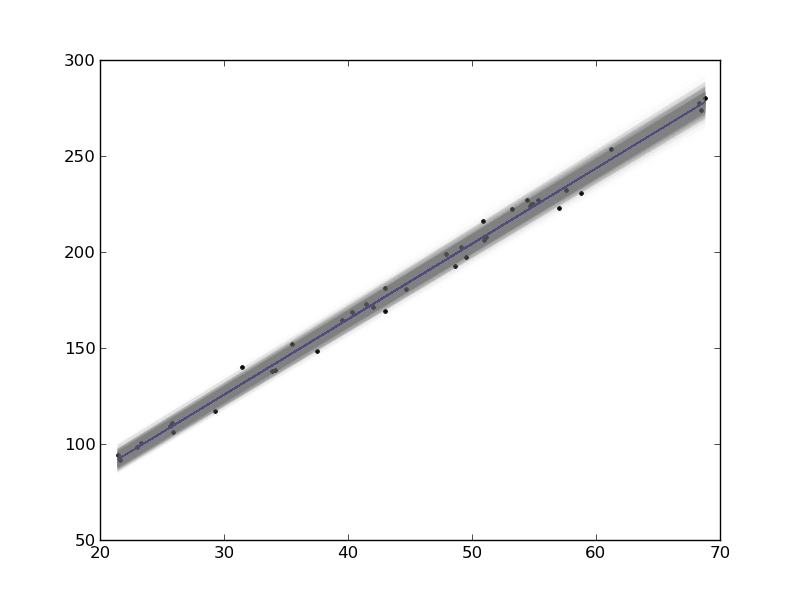
In this example, we show how to visualize uncertainty in a fit. The idea is to fit a model to data, and get the uncertainty in the model parameters. Then we sample the parameters according to the normal distribution, and plot the corresponding distribution of models. We use transparent lines and allow the overlap to indicate the density of the fits.
The data is stored in a text file download PT.txt , with the following structure:
Run          Ambient                            Fitted
 Order  Day  Temperature  Temperature  Pressure    Value    Residual
  1      1      23.820      54.749      225.066   222.920     2.146
...
We need to read the data in, and perform a regression analysis on P vs. T. In python we start counting at 0, so we actually want columns 3 and 4.
import numpy as np
import matplotlib.pyplot as plt
from pycse import regress

data = np.loadtxt('../../pycse/data/PT.txt', skiprows=2)
T = data[:, 3]
P = data[:, 4]

A = np.column_stack([T**0, T])

p, pint, se = regress(A, P, 0.05)

print p, pint, se
plt.plot(T, P, 'k.')
plt.plot(T, np.dot(A, p))

# Now we plot the distribution of possible lines
N = 2000
B = np.random.normal(p[0], se[0], N)
M = np.random.normal(p[1], se[1], N)
x = np.array([min(T), max(T)])

for b,m in zip(B, M):
    plt.plot(x, m*x + b, '-', color='gray', alpha=0.02)
plt.savefig('images/plotting-uncertainty.png')
[ 7.74899739  3.93014044] [[  2.97964903  12.51834576]
 [  3.82740876   4.03287211]] [ 2.35384765  0.05070183]

Here you can see 2000 different lines that have some probability of being correct. The darkest gray is near the fit, as expected; the darker the gray the more probable it is the line. This is a qualitative way of judging the quality of the fit.
Note, this is not the prediction error that we are plotting, that is the uncertainty in where a predicted y-value is.
Copyright (C) 2013 by John Kitchin. See the License for information about copying.