Table of Contents
1 Intermediate Pandas
Today we look at some ways to use Pandas DataFrames like databases.
1.1 Revisiting a previous example with batches of data
We start with the example we looked at before. It is a dataset from a set of experiments. The experiments are grouped by the Day they were run on. We will use Pandas to do some analysis by the day.
fname = '04-p-t.dat'
url = 'https://www.itl.nist.gov/div898/handbook/datasets/MODEL-4_4_4.DAT'

import urllib.request
urllib.request.urlretrieve(url, fname)

import pandas as pd
df = pd.read_csv('03-p-t.dat', delimiter='\s+', skiprows=2,
                 names=['Run order', 'Day', 'Ambient Temperature', 'Temperature',
                        'Pressure', 'Fitted Value', 'Residual'])
df
    Run order  Day  Ambient Temperature  Temperature  Pressure  Fitted Value  \
0           1    1               23.820       54.749   225.066       222.920
1           2    1               24.120       23.323   100.331        99.411
2           3    1               23.434       58.775   230.863       238.744
3           4    1               23.993       25.854   106.160       109.359
4           5    1               23.375       68.297   277.502       276.165
5           6    1               23.233       37.481   148.314       155.056
6           7    1               24.162       49.542   197.562       202.456
7           8    1               23.667       34.101   138.537       141.770
8           9    1               24.056       33.901   137.969       140.983
9          10    1               22.786       29.242   117.410       122.674
10         11    2               23.785       39.506   164.442       163.013
11         12    2               22.987       43.004   181.044       176.759
12         13    2               23.799       53.226   222.179       216.933
13         14    2               23.661       54.467   227.010       221.813
14         15    2               23.852       57.549   232.496       233.925
15         16    2               23.379       61.204   253.557       248.288
16         17    2               24.146       31.489   139.894       131.506
17         18    2               24.187       68.476   273.931       276.871
18         19    2               24.159       51.144   207.969       208.753
19         20    2               23.803       68.774   280.205       278.040
20         21    3               24.381       55.350   227.060       225.282
21         22    3               24.027       44.692   180.605       183.396
22         23    3               24.342       50.995   206.229       208.167
23         24    3               23.670       21.602    91.464        92.649
24         25    3               24.246       54.673   223.869       222.622
25         26    3               25.082       41.449   172.910       170.651
26         27    3               24.575       35.451   152.073       147.075
27         28    3               23.803       42.989   169.427       176.703
28         29    3               24.660       48.599   192.561       198.748
29         30    3               24.097       21.448    94.448        92.042
30         31    4               22.816       56.982   222.794       231.697
31         32    4               24.167       47.901   199.003       196.008
32         33    4               22.712       40.285   168.668       166.077
33         34    4               23.611       25.609   109.387       108.397
34         35    4               23.354       22.971    98.445        98.029
35         36    4               23.669       25.838   110.987       109.295
36         37    4               23.965       49.127   202.662       200.826
37         38    4               22.917       54.936   224.773       223.653
38         39    4               23.546       50.917   216.058       207.859
39         40    4               24.450       41.976   171.469       172.720

    Residual
0      2.146
1      0.920
2     -7.881
3     -3.199
4      1.336
5     -6.741
6     -4.895
7     -3.232
8     -3.014
9     -5.263
10     1.429
11     4.285
12     5.246
13     5.198
14    -1.429
15     5.269
16     8.388
17    -2.940
18    -0.784
19     2.165
20     1.779
21    -2.791
22    -1.938
23    -1.186
24     1.247
25     2.259
26     4.998
27    -7.276
28    -6.188
29     2.406
30    -8.902
31     2.996
32     2.592
33     0.990
34     0.416
35     1.692
36     1.835
37     1.120
38     8.199
39    -1.251
The first aggregation we will look at is how to make groups of data that are related by values in a column. We use the groupby function (https://pandas.pydata.org/pandas-docs/stable/reference/api/pandas.DataFrame.groupby.html#pandas.DataFrame.groupby), and specify a column to group on. The result is a DataFrameGroupBy object, which we next have to work with.
groups = df.groupby('Day')
type(groups)
pandas.core.groupby.generic.DataFrameGroupBy
The groups can describe themselves. Here we see we get 4 groups, one for each day, and you can see some statistics about each group. We do not need those for now.
groups.describe()
    Run order                                                 \
        count  mean      std   min    25%   50%    75%   max
Day
1        10.0   5.5  3.02765   1.0   3.25   5.5   7.75  10.0
2        10.0  15.5  3.02765  11.0  13.25  15.5  17.75  20.0
3        10.0  25.5  3.02765  21.0  23.25  25.5  27.75  30.0
4        10.0  35.5  3.02765  31.0  33.25  35.5  37.75  40.0

    Ambient Temperature           ... Fitted Value          Residual          \
                  count     mean  ...          75%      max    count    mean
Day                               ...
1                  10.0  23.6646  ...    217.80400  276.165     10.0 -2.9823
2                  10.0  23.7758  ...    244.69725  278.040     10.0  2.6827
3                  10.0  24.2883  ...    205.81225  225.282     10.0 -0.6690
4                  10.0  23.5207  ...    206.10075  231.697     10.0  0.9687


          std    min      25%     50%      75%    max
Day
1    3.452383 -7.881 -5.17100 -3.2155 -0.06350  2.146
2    3.606824 -2.940 -0.23075  3.2250  5.23400  8.388
3    3.948274 -7.276 -2.57775  0.0305  2.13900  4.998
4    4.255487 -8.902  0.55950  1.4060  2.40275  8.199

[4 rows x 48 columns]
We can get a dictionary of the group names and labels from the groups attribute.
groups.groups
{1: Int64Index([0, 1, 2, 3, 4, 5, 6, 7, 8, 9], dtype='int64'),
 2: Int64Index([10, 11, 12, 13, 14, 15, 16, 17, 18, 19], dtype='int64'),
 3: Int64Index([20, 21, 22, 23, 24, 25, 26, 27, 28, 29], dtype='int64'),
 4: Int64Index([30, 31, 32, 33, 34, 35, 36, 37, 38, 39], dtype='int64')}
We can get the subset of rows from those group labels.
df.loc[groups.groups[2]]
    Run order  Day  Ambient Temperature  Temperature  Pressure  Fitted Value  \
10         11    2               23.785       39.506   164.442       163.013
11         12    2               22.987       43.004   181.044       176.759
12         13    2               23.799       53.226   222.179       216.933
13         14    2               23.661       54.467   227.010       221.813
14         15    2               23.852       57.549   232.496       233.925
15         16    2               23.379       61.204   253.557       248.288
16         17    2               24.146       31.489   139.894       131.506
17         18    2               24.187       68.476   273.931       276.871
18         19    2               24.159       51.144   207.969       208.753
19         20    2               23.803       68.774   280.205       278.040

    Residual
10     1.429
11     4.285
12     5.246
13     5.198
14    -1.429
15     5.269
16     8.388
17    -2.940
18    -0.784
19     2.165
We don't usually work with groups that way though, it is more common to do some analysis on each group.
Suppose we want to plot the Pressure vs Temperature for each group, so we can see visually if there are any trends that could be attributed to the group. To do this, we need to iterate over the groups and then make a plot on each one.
A DataFrameGroupBy is iterable and when you loop over it, you get the key it was grouped on, and a DataFrame that contains the items in the group. Here we loop over each group, and plot each group with a different color.
%matplotlib inline
import matplotlib.pyplot as plt

fig, ax = plt.subplots()
for (day, group) in groups:
    group.plot('Temperature', 'Pressure', ax=ax, label=f'{day}', style='o')
plt.ylabel('Pressure')
Text(0, 0.5, 'Pressure')
<Figure size 432x288 with 1 Axes>
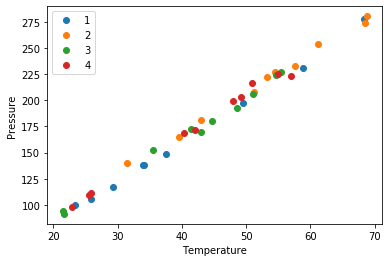
the point of this is we cannot see a visual clustering of the groups by day. That is important, because if we did it could suggest something was different that day.
1.2 Combining data sets
Siddhant Lambor provided from two experiments conducted to measure the properties of a worm-like micelles solution. He had carried out experiments on a rheometer to measure the viscosity of a worm-like micelles solution in a Couette cell geometry and a Cone and Plate geometry. Ideally, there should not be a difference as viscosity is intrinsic to the fluid. Analysis of this data will confirm if that is true. First, we read this data in from the two data files.
url = 'https://drive.google.com/uc?id=1PaBg_dpK2_Ot8yvJr5Lwsa8e_3H9OErH'

import urllib.request
urllib.request.urlretrieve(url, 'couette.xls')
('couette.xls', <http.client.HTTPMessage at 0x128f1cd90>)
couette = pd.read_excel('couette.xls',
                   sheet_name='Flow sweep - 1',
                   header=1) # sheet name is case sensitive, excel file name is not

couette
We can drop the row at index 0, it just has the units in it. With this syntax, we have to save the resulting DataFrame back into the variable, or it will not be changed.
couette = couette.drop(0)
couette
Now get the second file.
url = 'https://drive.google.com/uc?id=1XtGJ-PStHNO5mqlSuFFkPEf2cQYlLie_'

import urllib.request
urllib.request.urlretrieve(url, 'cp.xls')
('cp.xls', <http.client.HTTPMessage at 0x128f34950>)
Here, we combine the drop function all into one line.
conePlate = pd.read_excel('cp.xls', sheet_name='Flow sweep - 1', header=1).drop(0)
conePlate.head(5)
For this analysis, we are only interested in the shear rate, stress and viscosity values. Let us drop the other columns. We do that by the names, and specify inplace=True, which modifies the DataFrame itself.
conePlate.drop(['Temperature', 'Step time', 'Normal stress'], axis=1, inplace=True)
# if we do not use inplace=True, the data frame will not be changed. It would by default create a new data frame
# and we would have to assign a different variable to capture this change.
conePlate.head(5)
We also do that for the couette data. Here we did not use inplace=True, so we have to save the result back into the variable to get the change.
couette = couette.drop(['Temperature', 'Step time', 'Normal stress'], axis=1)   # without using inplace = True
couette.head(5)
We can see info about each DataFrame like this.
couette.info()
conePlate.info()
We could proceed to analyze the DataFrames separately, but instead, we will combine them into one DataFrame. Before doing that, we need to add a column to each one so we know which data set is which. Simply assigning a value to a new column name will do that.
couette['type'] = 'couette'
couette
conePlate['type'] = 'cone'
Now, we can combine these into a single DataFrame. This is not critical, and you can get by without it, but I want to explore the idea, and illustrate it is possible.
df = pd.concat([conePlate, couette])
df
Finally, we are ready for the visualization. We will group the DataFrame and then make plots for each group. Here we illustrate several new arguments, including loglog plots, secondary axes, colored tick labels, and multiple legends.
g = df.groupby('type')
ax1 = g.get_group('cone').plot('Shear rate', 'Viscosity',
                               logx=True, logy=True, style='b.-',
                               label="CP viscosity")

g.get_group('couette').plot('Shear rate', 'Viscosity', logx=True, logy=True,
                            style='g.-', ax=ax1, label="Couette viscosity")

ax2 = g.get_group('cone').plot('Shear rate', 'Stress', secondary_y=True,
                               logx=True, logy=True, style='r.-',
                               ax=ax1, label="CP stress")

g.get_group('couette').plot('Shear rate', 'Stress', secondary_y=True,
                            logx=True, logy = True, style='y.', ax=ax2,
                            label="Couette Stress")

# Setting y axis labels
ax1.set_ylabel("Viscosity (Pa.s)", color='b')
[ticklabel.set_color('b') for ticklabel in ax1.get_yticklabels()]

ax2.set_ylabel("Stress (Pa)", color='r')
[ticklabel.set_color('r') for ticklabel in ax1.get_yticklabels()]

# setting legend locations
ax1.legend(loc=6)
ax2.legend(loc=7)

ax1.set_xlabel("Shear rate (1/s)")
plt.title("Comparison of Cone and Plate with Couette Cell")
So, in fact we can see these two experiments are practically equivalent.
1.3 Monitoring Covid cases as a function of time
This site provides COVID data for all the countries in the world as a function of time.
We are going to use this data set to illustrate several concepts in data analysis.
https://www.tableau.com/about/blog/2020/3/ten-considerations-you-create-another-chart-about-covid-19
read_csv is flexible enough to directly read the data from a URL that exports the google sheet as CSV data. The only new wrinkle here is we tell it some column names that should be parsed as dates.
import pandas as pd


url = 'https://docs.google.com/spreadsheets/d/14quQPFErG-hlpsrNgYcX85vW7JMMK5X2vNZrafRcH8c/export?format=csv&id=14quQPFErG-hlpsrNgYcX85vW7JMMK5X2vNZrafRcH8c'

df = pd.read_csv(url, parse_dates=['Date', 'Prep_Flow_Runtime'])
df
       Case_Type  Cases  Difference       Date Country_Region Province_State  \
0         Deaths    0.0         0.0 2020-02-27        Bahamas            NaN
1      Confirmed   16.0         0.0 2020-02-16        Germany            NaN
2         Deaths    0.0         0.0 2020-01-31         Canada        Alberta
3         Deaths    0.0         0.0 2020-03-04      Australia     Queensland
4      Confirmed    0.0         0.0 2020-01-25       Suriname            NaN
...          ...    ...         ...        ...            ...            ...
85013     Deaths    1.0         NaN 2020-03-23             US       Maryland
85014     Deaths    0.0         NaN 2020-03-23             US         Oregon
85015  Confirmed    6.0         NaN 2020-03-23             US  Massachusetts
85016  Confirmed    0.0         NaN 2020-03-23             US         Kansas
85017     Deaths    0.0         NaN 2020-03-23             US       Nebraska

           Admin2                  Combined_Key     FIPS        Lat  \
0             NaN                           NaN      NaN  25.034300
1             NaN                           NaN      NaN  51.000000
2             NaN                           NaN      NaN  53.933300
3             NaN                           NaN      NaN -28.016700
4             NaN                           NaN      NaN   3.919300
...           ...                           ...      ...        ...
85013  Montgomery      Montgomery, Maryland, US  24031.0  39.136763
85014   Jefferson         Jefferson, Oregon, US  41031.0  44.628068
85015   Hampshire  Hampshire, Massachusetts, US  25015.0  42.339980
85016    Marshall          Marshall, Kansas, US  20117.0  39.783597
85017      Garden          Garden, Nebraska, US  31069.0  41.617031

             Long Prep_Flow_Runtime    Table_Names
0      -77.396300        2020-03-29    Time Series
1        9.000000        2020-03-29    Time Series
2     -116.576500        2020-03-29    Time Series
3      153.400000        2020-03-29    Time Series
4      -56.027800        2020-03-29    Time Series
...           ...               ...            ...
85013  -77.203582        2020-03-29  Daily Summary
85014 -121.178320        2020-03-29  Daily Summary
85015  -72.658985        2020-03-29  Daily Summary
85016  -96.522790        2020-03-29  Daily Summary
85017 -102.331397        2020-03-29  Daily Summary

[85018 rows x 13 columns]
Let's get the data out of this for Pennsylvania. The first step is not hard, we just select the rows for Pennsylvania.
df[df['Province_State'] == 'Pennsylvania']
       Case_Type  Cases  Difference       Date Country_Region Province_State  \
33278     Deaths    0.0         0.0 2020-01-28             US   Pennsylvania
33426  Confirmed    7.0         1.0 2020-03-09             US   Pennsylvania
33552     Deaths    0.0         0.0 2020-02-07             US   Pennsylvania
33621  Confirmed    0.0         0.0 2020-02-25             US   Pennsylvania
33624  Confirmed    0.0         0.0 2020-02-07             US   Pennsylvania
...          ...    ...         ...        ...            ...            ...
84583     Deaths    0.0         NaN 2020-03-23             US   Pennsylvania
84775  Confirmed    3.0         NaN 2020-03-23             US   Pennsylvania
84910     Deaths    0.0         NaN 2020-03-23             US   Pennsylvania
84949  Confirmed   23.0         NaN 2020-03-23             US   Pennsylvania
85000  Confirmed    1.0         NaN 2020-03-23             US   Pennsylvania

            Admin2                   Combined_Key     FIPS        Lat  \
33278          NaN                            NaN      NaN  39.907800
33426          NaN                            NaN      NaN  39.907800
33552          NaN                            NaN      NaN  39.907800
33621          NaN                            NaN      NaN  39.907800
33624          NaN                            NaN      NaN  39.907800
...            ...                            ...      ...        ...
84583      Clarion      Clarion, Pennsylvania, US  42031.0  41.192658
84775       Centre       Centre, Pennsylvania, US  42027.0  40.920589
84910        Blair        Blair, Pennsylvania, US  42013.0  40.479614
84949  Northampton  Northampton, Pennsylvania, US  42095.0  40.751827
85000      Fayette      Fayette, Pennsylvania, US  42051.0  39.920410

            Long Prep_Flow_Runtime    Table_Names
33278 -77.209800        2020-03-29    Time Series
33426 -77.209800        2020-03-29    Time Series
33552 -77.209800        2020-03-29    Time Series
33621 -77.209800        2020-03-29    Time Series
33624 -77.209800        2020-03-29    Time Series
...          ...               ...            ...
84583 -79.424135        2020-03-29  Daily Summary
84775 -77.822006        2020-03-29  Daily Summary
84910 -78.349174        2020-03-29  Daily Summary
84949 -75.304718        2020-03-29  Daily Summary
85000 -79.642912        2020-03-29  Daily Summary

[1062 rows x 13 columns]
You can see here there are a few challenges in this data:
- There are two types of data: Confirmed cases, and Deaths
- There are two types of rows: "Time Series" and "Daily Summary"
- For the "Daily Summary" there are multiple entries on the same day for different regions in PA.
Let's pull the data apart in a few ways. The Time Series data looks like it is already aggregated. How can we tell? Let's look at the series of dates in this subset. You can see that there are 61 unique values of the date, and 61 values in the data frame. That can only be true if there is a single instance of each date.
d1 =  df[(df['Province_State'] == 'Pennsylvania') & (df['Table_Names'] == 'Time Series') & (df['Case_Type'] == 'Confirmed')]['Date']
len(d1), len(d1.unique())
:results:
(61, 61)
Let's now group these by the Case_Type. This will split the selected rows into two groups, one for Confirmed and one for Deaths. Then we can plot these by getting each group, which returns a DataFrame. Here we string together several commands so we get the group and plot in a single line.
d1 =  df[(df['Province_State'] == 'Pennsylvania') & (df['Table_Names'] == 'Time Series')]
g1 = d1.groupby('Case_Type')

ax = g1.get_group('Confirmed').plot(x='Date', y='Cases', label='Confirmed')
g1.get_group('Deaths').plot(x='Date', y='Cases', ax=ax, label='Deaths')
:results:
<Figure size 432x288 with 1 Axes>

To see how this compares to the Daily Summary we need to take several steps. Let's narrow down these into independent cells so we can easily follow what is happening. Later we will combine this into a more compact syntax.
g1 = df.groupby('Province_State')

PA = g1.get_group('Pennsylvania')
PA
:results:
Next, we get the group for the Daily Summary.
ds = PA.groupby('Table_Names').get_group('Daily Summary')
ds
:results:
       Case_Type  Cases  Difference       Date Country_Region Province_State  \
36623     Deaths    NaN         3.0 2020-03-23             US   Pennsylvania
38135  Confirmed    NaN       189.0 2020-03-23             US   Pennsylvania
41376  Confirmed    1.0         1.0 2020-03-26             US   Pennsylvania
41377  Confirmed    1.0         0.0 2020-03-29             US   Pennsylvania
41378  Confirmed    1.0         0.0 2020-03-28             US   Pennsylvania
...          ...    ...         ...        ...            ...            ...
84583     Deaths    0.0         NaN 2020-03-23             US   Pennsylvania
84775  Confirmed    3.0         NaN 2020-03-23             US   Pennsylvania
84910     Deaths    0.0         NaN 2020-03-23             US   Pennsylvania
84949  Confirmed   23.0         NaN 2020-03-23             US   Pennsylvania
85000  Confirmed    1.0         NaN 2020-03-23             US   Pennsylvania

            Admin2                   Combined_Key     FIPS        Lat  \
36623          NaN                            NaN      NaN  39.907800
38135          NaN                            NaN      NaN  39.907800
41376  Susquehanna  Susquehanna, Pennsylvania, US  42115.0  41.821478
41377  Susquehanna  Susquehanna, Pennsylvania, US  42115.0  41.821478
41378  Susquehanna  Susquehanna, Pennsylvania, US  42115.0  41.821478
...            ...                            ...      ...        ...
84583      Clarion      Clarion, Pennsylvania, US  42031.0  41.192658
84775       Centre       Centre, Pennsylvania, US  42027.0  40.920589
84910        Blair        Blair, Pennsylvania, US  42013.0  40.479614
84949  Northampton  Northampton, Pennsylvania, US  42095.0  40.751827
85000      Fayette      Fayette, Pennsylvania, US  42051.0  39.920410

            Long Prep_Flow_Runtime    Table_Names
36623 -77.209800        2020-03-29  Daily Summary
38135 -77.209800        2020-03-29  Daily Summary
41376 -75.800720        2020-03-29  Daily Summary
41377 -75.800720        2020-03-29  Daily Summary
41378 -75.800720        2020-03-29  Daily Summary
...          ...               ...            ...
84583 -79.424135        2020-03-29  Daily Summary
84775 -77.822006        2020-03-29  Daily Summary
84910 -78.349174        2020-03-29  Daily Summary
84949 -75.304718        2020-03-29  Daily Summary
85000 -79.642912        2020-03-29  Daily Summary

[940 rows x 13 columns]
Now, we need to group this by case type and date, then we sum up each group. This will make two groups containing the aggregated sum by date of each case type.
d = ds.groupby(['Case_Type', 'Date']).sum()
d
                       Cases  Difference       FIPS         Lat         Long
Case_Type Date
Confirmed 2020-03-23   698.0       189.0  2818489.0  2774.71905 -5277.436095
          2020-03-24   946.0       248.0  2818489.0  2734.81125 -5200.226295
          2020-03-25  1260.0       314.0  2818489.0  2734.81125 -5200.226295
          2020-03-26  1795.0       535.0  2818489.0  2734.81125 -5200.226295
          2020-03-27  2345.0       550.0  2818489.0  2734.81125 -5200.226295
          2020-03-28  2845.0       500.0  2818489.0  2734.81125 -5200.226295
          2020-03-29  3432.0       587.0  2818489.0  2734.81125 -5200.226295
Deaths    2020-03-23     6.0         3.0  2818489.0  2774.71905 -5277.436095
          2020-03-24     8.0         2.0  2818489.0  2734.81125 -5200.226295
          2020-03-25    15.0         7.0  2818489.0  2734.81125 -5200.226295
          2020-03-26    18.0         3.0  2818489.0  2734.81125 -5200.226295
          2020-03-27    22.0         4.0  2818489.0  2734.81125 -5200.226295
          2020-03-28    34.0        12.0  2818489.0  2734.81125 -5200.226295
          2020-03-29    41.0         7.0  2818489.0  2734.81125 -5200.226295
Finally, we can plot these results. To access the two case types, we note that Case_Type is the index in this new DataFrame, so we can use loc to get each one.
ax = d.loc['Confirmed'].plot(y='Cases')
d.loc['Deaths'].plot(y='Cases', ax=ax)
<Figure size 432x288 with 1 Axes>

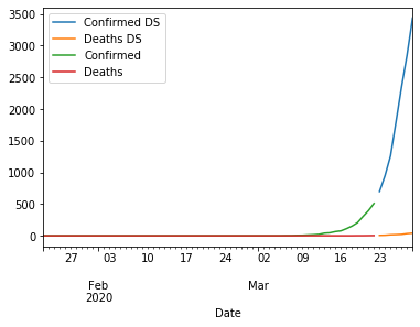
So we can see over the past 5 days, the number of cases is growing fast. We can pretty easily combine these to see the longitudinal trend over time.
g2 = df.groupby(['Province_State', 'Table_Names', 'Case_Type', 'Date'])
df2 = g2.sum()
ax = df2.loc[('Pennsylvania', 'Daily Summary', 'Confirmed')].plot(y='Cases', label='Confirmed DS')
df2.loc[('Pennsylvania', 'Daily Summary', 'Deaths')].plot(y='Cases', ax=ax, label='Deaths DS')

df2.loc[('Pennsylvania', 'Time Series', 'Confirmed')].plot(y='Cases', ax=ax, label='Confirmed')
df2.loc[('Pennsylvania', 'Time Series', 'Deaths')].plot(y='Cases', ax=ax, label='Deaths')
:results:
<Figure size 432x288 with 1 Axes>
:results:
You can see the cases are growing fast.
Exercise
- Perform this analysis for another State
- Perform this analysis for a country