Nonlinear curve fitting by direct least squares minimization

| categories: data analysis | tags:

Here is an example of fitting a nonlinear function to data by direct minimization of the summed squared error.

from scipy.optimize import fmin
import numpy as np

volumes = np.array([13.71, 14.82, 16.0, 17.23, 18.52])

energies = np.array([-56.29, -56.41, -56.46, -56.463,-56.41])

def Murnaghan(parameters,vol):
    'From PRB 28,5480 (1983'
    E0 = parameters[0]
    B0 = parameters[1]
    BP = parameters[2]
    V0 = parameters[3]

    E = E0 + B0*vol/BP*(((V0/vol)**BP)/(BP-1)+1) - V0*B0/(BP-1.)

    return E

def objective(pars,vol):
    #we will minimize this function
    err =  energies - Murnaghan(pars,vol)
    return np.sum(err**2) #we return the summed squared error directly

x0 = [ -56., 0.54, 2., 16.5] #initial guess of parameters

plsq = fmin(objective,x0,args=(volumes,)) #note args is a tuple

print 'parameters = {0}'.format(plsq)

import matplotlib.pyplot as plt
plt.plot(volumes,energies,'ro')

#plot the fitted curve on top
x = np.linspace(min(volumes),max(volumes),50)
y = Murnaghan(plsq,x)
plt.plot(x,y,'k-')
plt.xlabel('Volume ($\AA^3$)')
plt.ylabel('Total energy (eV)')
plt.savefig('images/nonlinear-fitting-lsq.png')
Optimization terminated successfully.
         Current function value: 0.000020
         Iterations: 137
         Function evaluations: 240
parameters = [-56.46932645   0.59141447   1.9044796   16.59341303]

Copyright (C) 2013 by John Kitchin. See the License for information about copying.

org-mode source

Discuss on Twitter

Linear regression with confidence intervals.

| categories: confidence interval, data analysis, linear regression | tags:

Matlab post Fit a fourth order polynomial to this data and determine the confidence interval for each parameter. Data from example 5-1 in Fogler, Elements of Chemical Reaction Engineering.

We want the equation \(Ca(t) = b0 + b1*t + b2*t^2 + b3*t^3 + b4*t^4\) fit to the data in the least squares sense. We can write this in a linear algebra form as: T*p = Ca where T is a matrix of columns [1 t t^2 t^3 t^4], and p is a column vector of the fitting parameters. We want to solve for the p vector and estimate the confidence intervals.

import numpy as np
from scipy.stats.distributions import  t

time = np.array([0.0, 50.0, 100.0, 150.0, 200.0, 250.0, 300.0])
Ca = np.array([50.0, 38.0, 30.6, 25.6, 22.2, 19.5, 17.4])*1e-3

T = np.column_stack([time**0, time, time**2, time**3, time**4])

p, res, rank, s = np.linalg.lstsq(T, Ca)
# the parameters are now in p

# compute the confidence intervals
n = len(Ca)
k = len(p)

sigma2 = np.sum((Ca - np.dot(T, p))**2) / (n - k)  # RMSE

C = sigma2 * np.linalg.inv(np.dot(T.T, T)) # covariance matrix
se = np.sqrt(np.diag(C)) # standard error

alpha = 0.05 # 100*(1 - alpha) confidence level

sT = t.ppf(1.0 - alpha/2.0, n - k) # student T multiplier
CI = sT * se

for beta, ci in zip(p, CI):
    print '{2: 1.2e} [{0: 1.4e} {1: 1.4e}]'.format(beta - ci, beta + ci, beta)

SS_tot = np.sum((Ca - np.mean(Ca))**2)
SS_err = np.sum((np.dot(T, p) - Ca)**2)

#  http://en.wikipedia.org/wiki/Coefficient_of_determination
Rsq = 1 - SS_err/SS_tot
print 'R^2 = {0}'.format(Rsq)

# plot fit
import matplotlib.pyplot as plt
plt.plot(time, Ca, 'bo', label='raw data')
plt.plot(time, np.dot(T, p), 'r-', label='fit')
plt.xlabel('Time')
plt.ylabel('Ca (mol/L)')
plt.legend(loc='best')
plt.savefig('images/linregress-conf.png')
 5.00e-02 [ 4.9680e-02  5.0300e-02]
-2.98e-04 [-3.1546e-04 -2.8023e-04]
 1.34e-06 [ 1.0715e-06  1.6155e-06]
-3.48e-09 [-4.9032e-09 -2.0665e-09]
 3.70e-12 [ 1.3501e-12  6.0439e-12]
R^2 = 0.999986967246

A fourth order polynomial fits the data well, with a good R^2 value. All of the parameters appear to be significant, i.e. zero is not included in any of the parameter confidence intervals. This does not mean this is the best model for the data, just that the model fits well.

Copyright (C) 2013 by John Kitchin. See the License for information about copying.

org-mode source

Discuss on Twitter

Nonlinear curve fitting with parameter confidence intervals

| categories: data analysis | tags:

Matlab post

We often need to estimate parameters from nonlinear regression of data. We should also consider how good the parameters are, and one way to do that is to consider the confidence interval. A confidence interval tells us a range that we are confident the true parameter lies in.

In this example we use a nonlinear curve-fitting function: scipy.optimize.curve_fit to give us the parameters in a function that we define which best fit the data. The scipy.optimize.curve_fit function also gives us the covariance matrix which we can use to estimate the standard error of each parameter. Finally, we modify the standard error by a student-t value which accounts for the additional uncertainty in our estimates due to the small number of data points we are fitting to.

We will fit the function \(y = a x / (b + x)\) to some data, and compute the 95% confidence intervals on the parameters.

# Nonlinear curve fit with confidence interval
import numpy as np
from scipy.optimize import curve_fit
from scipy.stats.distributions import  t

x = np.array([0.5, 0.387, 0.24, 0.136, 0.04, 0.011])
y = np.array([1.255, 1.25, 1.189, 1.124, 0.783, 0.402])

# this is the function we want to fit to our data
def func(x, a, b):
    'nonlinear function in a and b to fit to data'
    return a * x / (b + x)

initial_guess = [1.2, 0.03]
pars, pcov = curve_fit(func, x, y, p0=initial_guess)

alpha = 0.05 # 95% confidence interval = 100*(1-alpha)

n = len(y)    # number of data points
p = len(pars) # number of parameters

dof = max(0, n - p) # number of degrees of freedom

# student-t value for the dof and confidence level
tval = t.ppf(1.0-alpha/2., dof) 

for i, p,var in zip(range(n), pars, np.diag(pcov)):
    sigma = var**0.5
    print 'p{0}: {1} [{2}  {3}]'.format(i, p,
                                  p - sigma*tval,
                                  p + sigma*tval)

import matplotlib.pyplot as plt
plt.plot(x,y,'bo ')
xfit = np.linspace(0,1)
yfit = func(xfit, pars[0], pars[1])
plt.plot(xfit,yfit,'b-')
plt.legend(['data','fit'],loc='best')
plt.savefig('images/nonlin-curve-fit-ci.png')
p0: 1.32753141454 [1.3005365922  1.35452623688]
p1: 0.0264615569701 [0.0236076538292  0.0293154601109]
(array([ 1.32753141,  0.02646156]), [[1.3005365921998688, 1.3545262368760884], [0.023607653829234403, 0.029315460110926929]], [0.0097228006732683319, 0.0010278982773703883])

You can see by inspection that the fit looks pretty reasonable. The parameter confidence intervals are not too big, so we can be pretty confident of their values.

Copyright (C) 2013 by John Kitchin. See the License for information about copying.

org-mode source

Discuss on Twitter

Curve fitting to get overlapping peak areas

| categories: data analysis | tags:

Today we examine an approach to fitting curves to overlapping peaks to deconvolute them so we can estimate the area under each curve. We have a text file that contains data from a gas chromatograph with two peaks that overlap. We want the area under each peak to estimate the gas composition. You will see how to read the text file in, parse it to get the data for plotting and analysis, and then how to fit it.

A line like “# of Points 9969” tells us the number of points we have to read. The data starts after a line containing “R.Time Intensity”. Here we read the number of points, and then get the data into arrays.

import numpy as np
import matplotlib.pyplot as plt

datafile = 'data/gc-data-21.txt'

i = 0
with open(datafile) as f:
    lines = f.readlines()

for i,line in enumerate(lines):
    if '# of Points' in line:
        npoints = int(line.split()[-1])
    elif 'R.Time        Intensity' in line:
        i += 1
        break

# now get the data
t, intensity = [], []
for j in range(i, i + npoints):
    fields = lines[j].split()
    t += [float(fields[0])]
    intensity += [int(fields[1])]

t = np.array(t)
intensity = np.array(intensity)

# now plot the data in the relevant time frame
plt.plot(t, intensity)
plt.xlim([4, 6])
plt.xlabel('Time (s)')
plt.ylabel('Intensity (arb. units)')
plt.savefig('images/deconvolute-1.png')
>>> >>> >>> >>> >>> ... ... >>> ... ... ... ... ... ... >>> ... >>> ... ... ... ... >>> >>> >>> >>> ... [<matplotlib.lines.Line2D object at 0x04CE6CF0>]
(4, 6)
<matplotlib.text.Text object at 0x04BBB950>
<matplotlib.text.Text object at 0x04BD0A10>

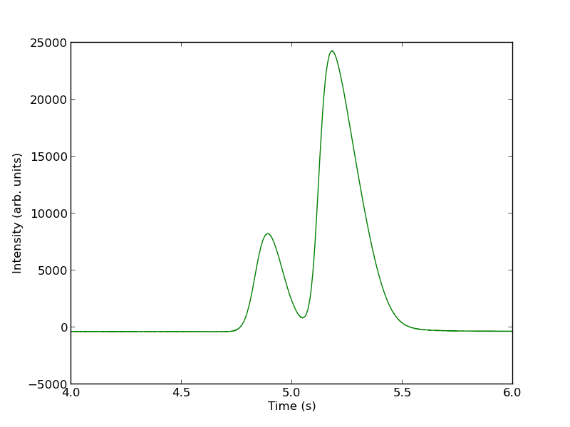
You can see there is a non-zero baseline. We will normalize that by the average between 4 and 4.4 seconds.

intensity -= np.mean(intensity[(t> 4) & (t < 4.4)])
plt.figure()
plt.plot(t, intensity)
plt.xlim([4, 6])
plt.xlabel('Time (s)')
plt.ylabel('Intensity (arb. units)')
plt.savefig('./images/deconvolute-2.png')
<matplotlib.figure.Figure object at 0x04CF7950>
[<matplotlib.lines.Line2D object at 0x04DF5C30>]
(4, 6)
<matplotlib.text.Text object at 0x04DDB690>
<matplotlib.text.Text object at 0x04DE3630>

The peaks are asymmetric, decaying gaussian functions. We define a function for this

from scipy.special import erf

def asym_peak(t, pars):
    'from Anal. Chem. 1994, 66, 1294-1301'
    a0 = pars[0]  # peak area
    a1 = pars[1]  # elution time
    a2 = pars[2]  # width of gaussian
    a3 = pars[3]  # exponential damping term
    f = (a0/2/a3*np.exp(a2**2/2.0/a3**2 + (a1 - t)/a3)
         *(erf((t-a1)/(np.sqrt(2.0)*a2) - a2/np.sqrt(2.0)/a3) + 1.0))
    return f

To get two peaks, we simply add two peaks together.

def two_peaks(t, *pars):    
    'function of two overlapping peaks'
    a10 = pars[0]  # peak area
    a11 = pars[1]  # elution time
    a12 = pars[2]  # width of gaussian
    a13 = pars[3]  # exponential damping term
    a20 = pars[4]  # peak area
    a21 = pars[5]  # elution time
    a22 = pars[6]  # width of gaussian
    a23 = pars[7]  # exponential damping term   
    p1 = asym_peak(t, [a10, a11, a12, a13])
    p2 = asym_peak(t, [a20, a21, a22, a23])
    return p1 + p2

To show the function is close to reasonable, we plot the fitting function with an initial guess for each parameter. The fit is not good, but we have only guessed the parameters for now.

parguess = (1500, 4.85, 0.05, 0.05, 5000, 5.1, 0.05, 0.1)
plt.figure()
plt.plot(t, intensity)
plt.plot(t,two_peaks(t, *parguess),'g-')
plt.xlim([4, 6])
plt.xlabel('Time (s)')
plt.ylabel('Intensity (arb. units)')
plt.savefig('images/deconvolution-3.png')
<matplotlib.figure.Figure object at 0x04FEF690>
[<matplotlib.lines.Line2D object at 0x05049870>]
[<matplotlib.lines.Line2D object at 0x04FEFA90>]
(4, 6)
<matplotlib.text.Text object at 0x0502E210>
<matplotlib.text.Text object at 0x050362B0>

Next, we use nonlinear curve fitting from scipy.optimize.curve_fit

from scipy.optimize import curve_fit

popt, pcov = curve_fit(two_peaks, t, intensity, parguess)
print popt

plt.plot(t, two_peaks(t, *popt), 'r-')
plt.legend(['data', 'initial guess','final fit'])

plt.savefig('images/deconvolution-4.png')
>>> >>> [  1.31039283e+03   4.87474330e+00   5.55414785e-02   2.50610175e-02
   5.32556821e+03   5.14121507e+00   4.68236129e-02   1.04105615e-01]
>>> [<matplotlib.lines.Line2D object at 0x0505BA10>]
<matplotlib.legend.Legend object at 0x05286270>

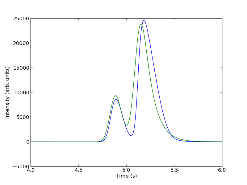
The fits are not perfect. The small peak is pretty good, but there is an unphysical tail on the larger peak, and a small mismatch at the peak. There is not much to do about that, it means the model peak we are using is not a good model for the peak. We will still integrate the areas though.

pars1 = popt[0:4]
pars2 = popt[4:8]

peak1 = asym_peak(t, pars1)
peak2 = asym_peak(t, pars2)

area1 = np.trapz(peak1, t)
area2 = np.trapz(peak2, t)

print 'Area 1 = {0:1.2f}'.format(area1)
print 'Area 2 = {0:1.2f}'.format(area2)

print 'Area 1 is {0:1.2%} of the whole area'.format(area1/(area1 + area2))
print 'Area 2 is {0:1.2%} of the whole area'.format(area2/(area1 + area2))

plt.figure()
plt.plot(t, intensity)
plt.plot(t, peak1, 'r-')
plt.plot(t, peak2, 'g-')
plt.xlim([4, 6])
plt.xlabel('Time (s)')
plt.ylabel('Intensity (arb. units)')
plt.legend(['data', 'peak 1', 'peak 2'])
plt.savefig('images/deconvolution-5.png')
>>> >>> >>> >>> >>> >>> >>> >>> Area 1 = 1310.39
Area 2 = 5325.57
>>> Area 1 is 19.75% of the whole area
Area 2 is 80.25% of the whole area
>>> <matplotlib.figure.Figure object at 0x05286ED0>
[<matplotlib.lines.Line2D object at 0x053A5AB0>]
[<matplotlib.lines.Line2D object at 0x05291D30>]
[<matplotlib.lines.Line2D object at 0x053B9810>]
(4, 6)
<matplotlib.text.Text object at 0x0529C4B0>
<matplotlib.text.Text object at 0x052A3450>
<matplotlib.legend.Legend object at 0x053B9ED0>

This sample was air, and the first peak is oxygen, and the second peak is nitrogen. we come pretty close to the actual composition of air, although it is low on the oxygen content. To do better, one would have to use a calibration curve.

In the end, the overlap of the peaks is pretty small, but it is still difficult to reliably and reproducibly deconvolute them. By using an algorithm like we have demonstrated here, it is possible at least to make the deconvolution reproducible.

1 Notable differences from Matlab

  1. The order of arguments to np.trapz is reversed.
  2. The order of arguments to the fitting function scipy.optimize.curve_fit is different than in Matlab.
  3. The scipy.optimize.curve_fit function expects a fitting function that has all parameters as arguments, where Matlab expects a vector of parameters.

Copyright (C) 2013 by John Kitchin. See the License for information about copying.

org-mode source

Discuss on Twitter
« Previous Page